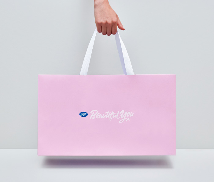
Beautiful You
Developing a premium yet personal beauty service
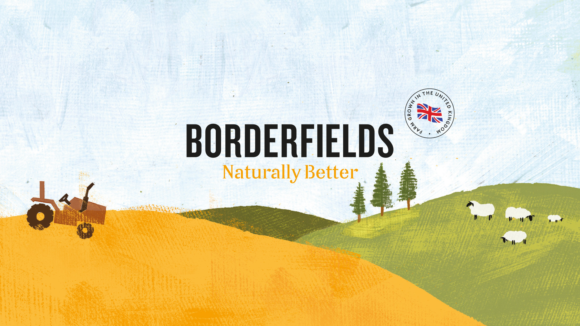
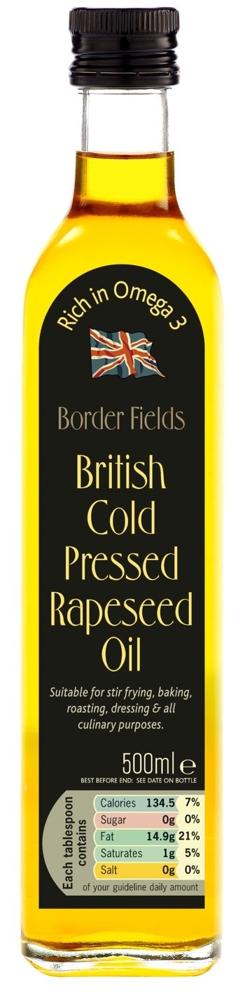
The Borderfields story began in 2005 when a group of local farmers from both sides of the English-Scottish border came together to create a premium cold pressed rapeseed oil from their crops. But, after a promising start, sales plateaued.
Borderfields recognized the need to update its brand if it was to get listed in major supermarkets, so approached us to develop a new identity that did justice to its range of innovative and tasty products.
0%
Just one year after our brand refresh, sales had soared by a remarkable 178%, helping Borderfields become the UK’s best-selling branded rapeseed oil.
No.1
With a 34% market share, Borderfields is now the number one brand in the rapeseed oil marketplace.
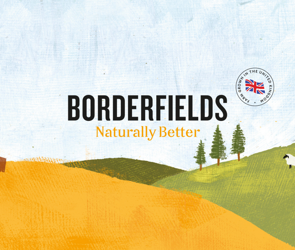
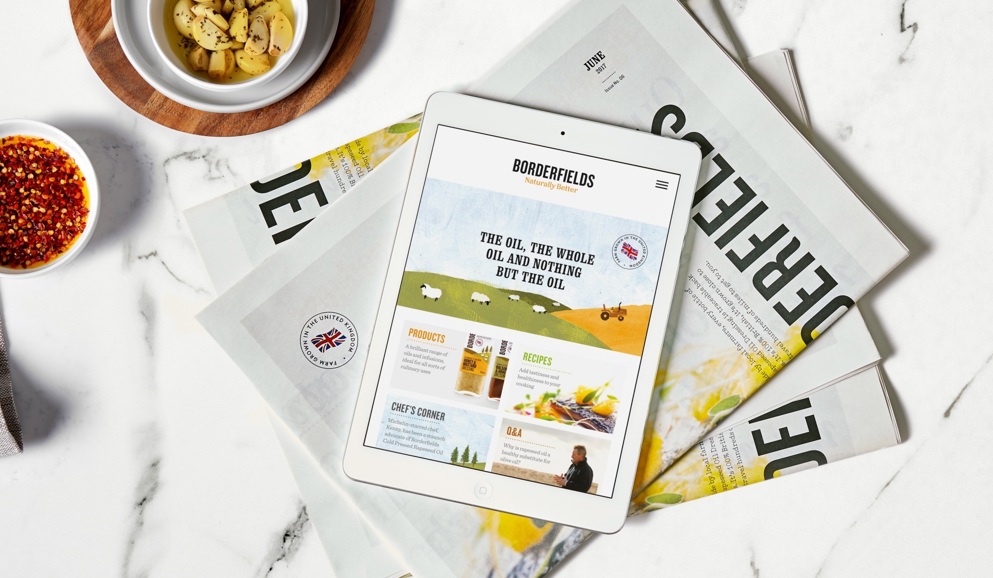
Our main challenge was to reposition Borderfields as an everyday cooking oil – a genuine alternative to olive oil. We developed a more accessible positioning for the brand that emphasised its versatility and health benefits. A new proposition – ‘Naturally better’ – served as the perfect springboard to build the brand’s new visual identity around.


Our research told us that Borderfields existed in a stale category with expected and repetitive design cues. There was nothing ‘feel-good’ on the shelves. So we packed Borderfields full of personality by finding a carefully calculated balance of innocence and approachable charm – bringing the brand to life with a ‘foodie’ design language that featured playful illustrations and beautifully shot photography.
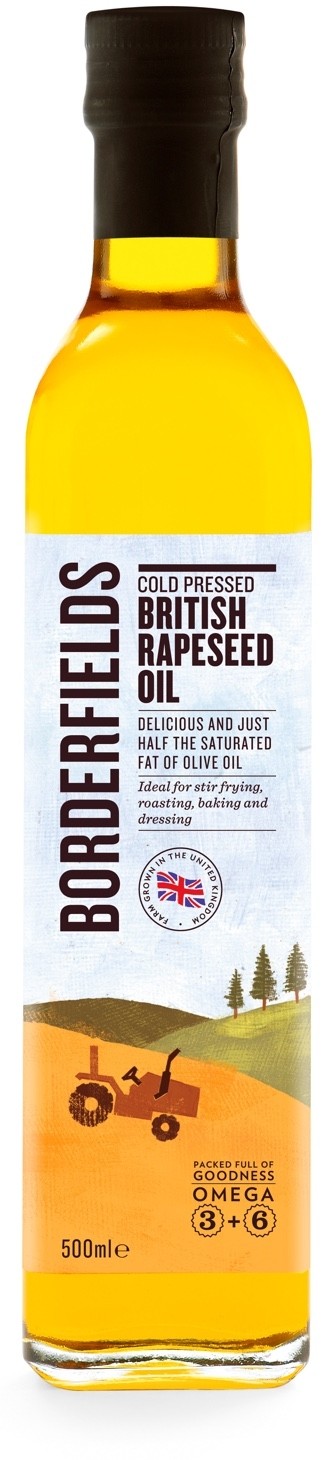
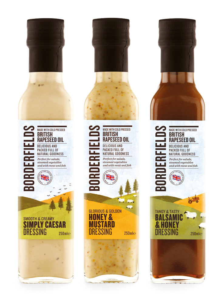
Much like its products, the brand’s packaging had to pack a flavourful punch. We redesigned the Borderfields range to do exactly that – covering every product in its portfolio, from oils to dressings to infusions.
Just a year after relaunching, Borderfields became the UK’s bestselling rapeseed oil and was being stocked by all ‘Big Four’ supermarkets (Sainsbury’s, Tesco, ASDA and Morrisons). The brand’s team has since been busy expanding the range to take advantage of its popularity.
Since Cubic’s rebrand, our products have taken pride of place on the shelves of the top four supermarkets. Borderfields is turning into the success story that it really deserves to be.
Ben Guy
Managing Director, Borderfields