NaughtOne – Sustainability
Telling a sustainable story
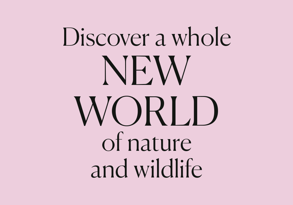
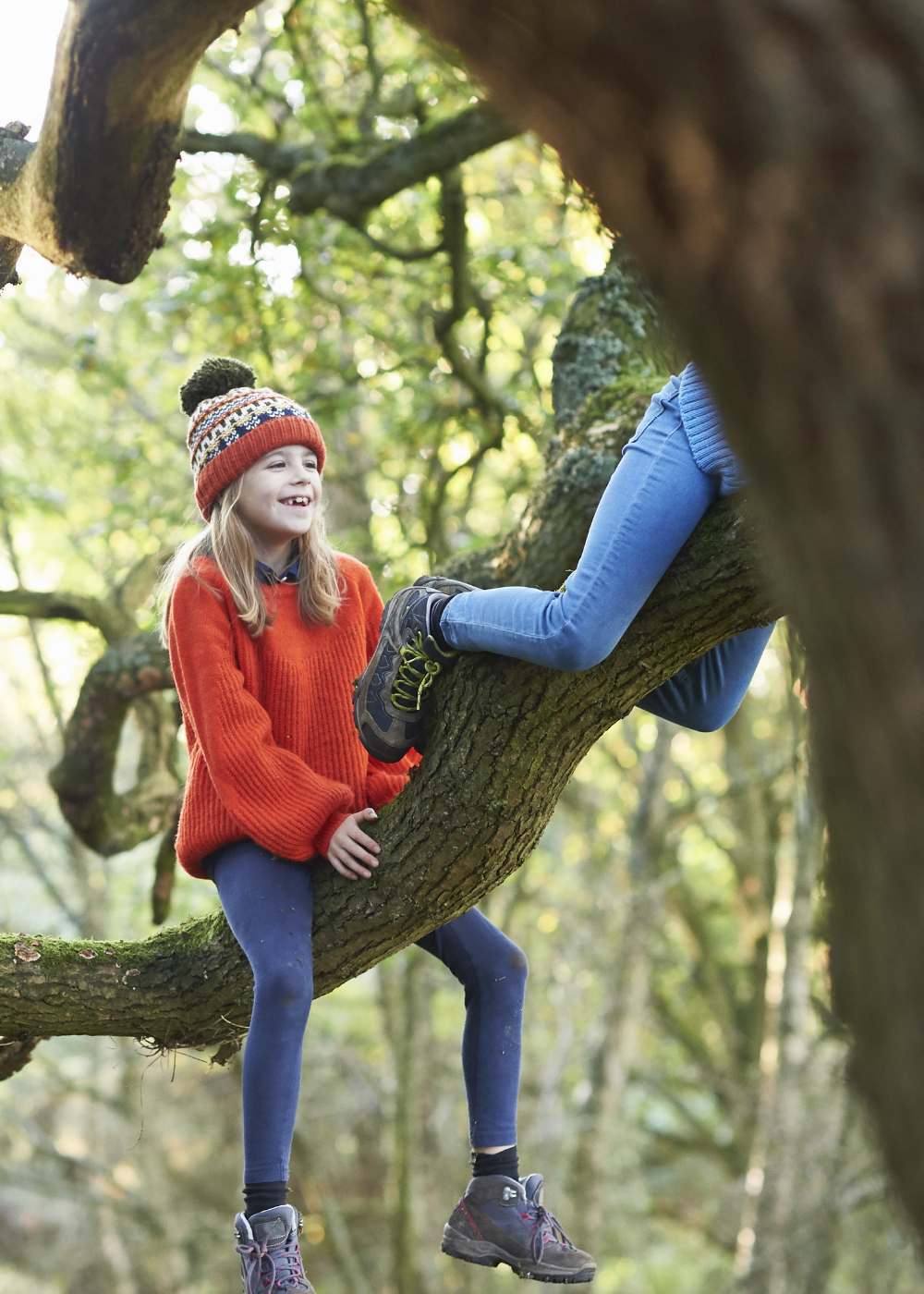
Wild Rutland is a proposed conservation-inspired visitor attraction put together by a family who have farmed its 1,200 acre site for generations. The ambition behind the project is to open up its visitors to a whole new world of nature – creating a captivating experience which compliments and reimagines the local landscape as it once was.
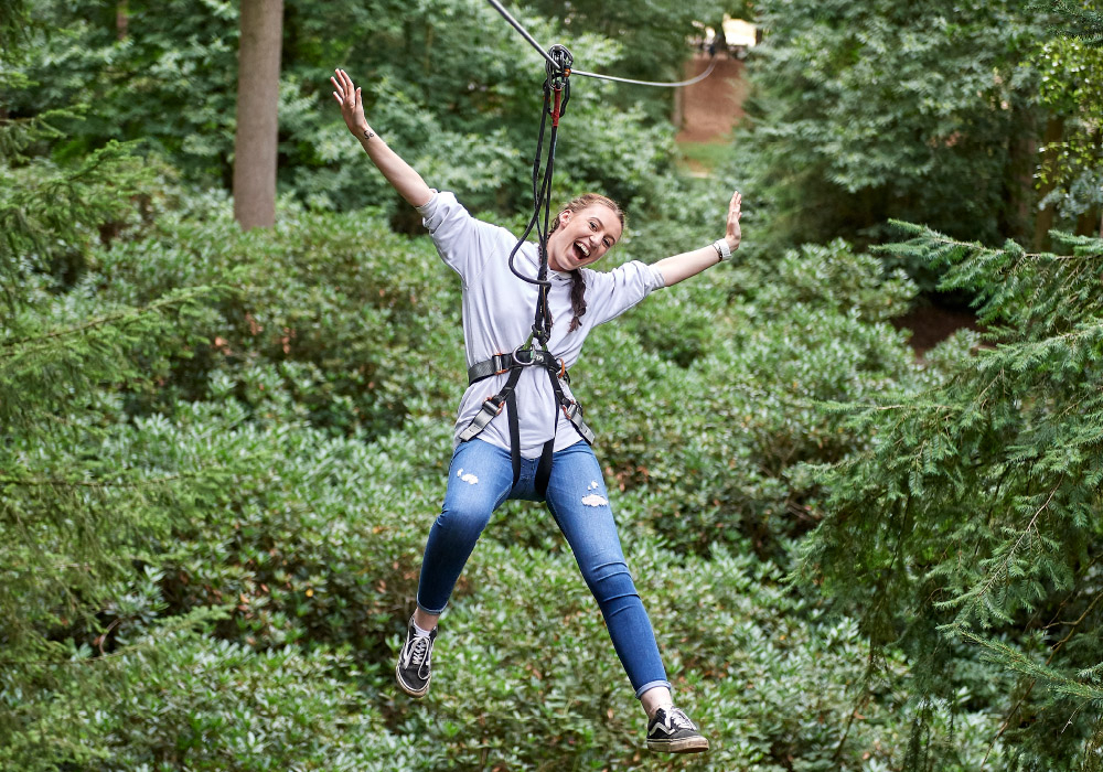
From the reintroduction of species that have been extinct in Britain for over a millennia – including Eurasion brown bears and lynx – to creating new opportunities for greater bird, insect and reptile diversity by improving the habitat and ecology of the area, Wild Rutland's intention is to facilitate education, play, adventure and enjoyment of the natural world.
It was our task to develop a brand that sets the foundations for the long-term – one that clarified its purpose, established genuine meaning and could guide the overall vision of the project from concept to reality.
1,200
Wild Rutland's 1,200 acre site will be home to numerous species of wildlife and animals native to the British Isles.
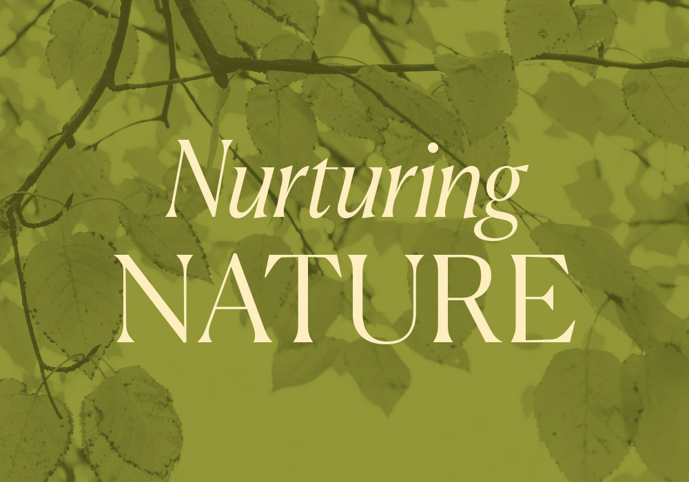
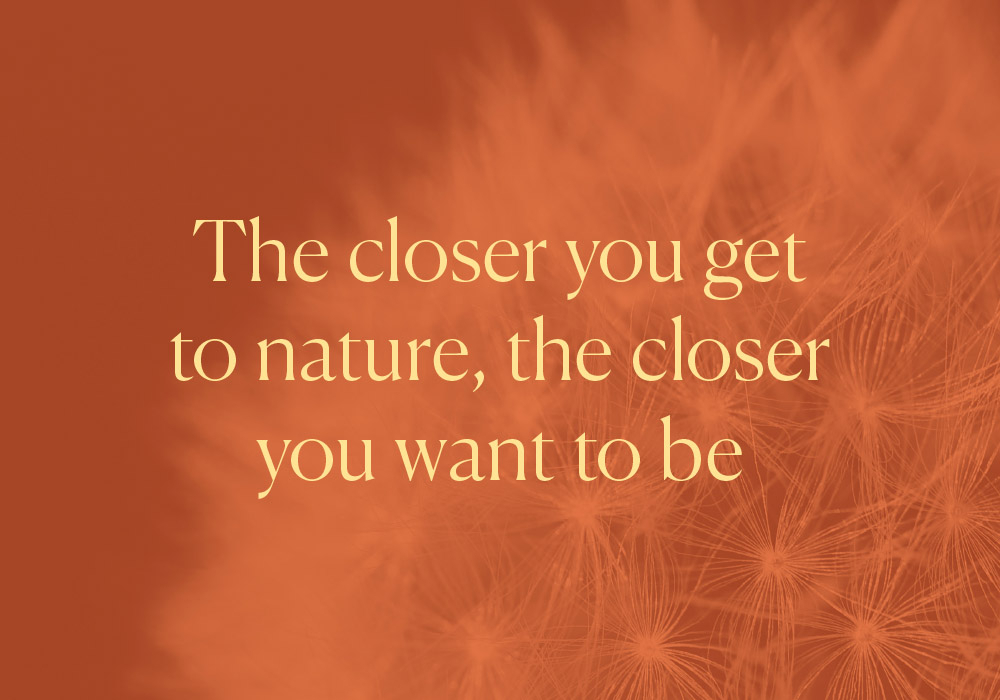
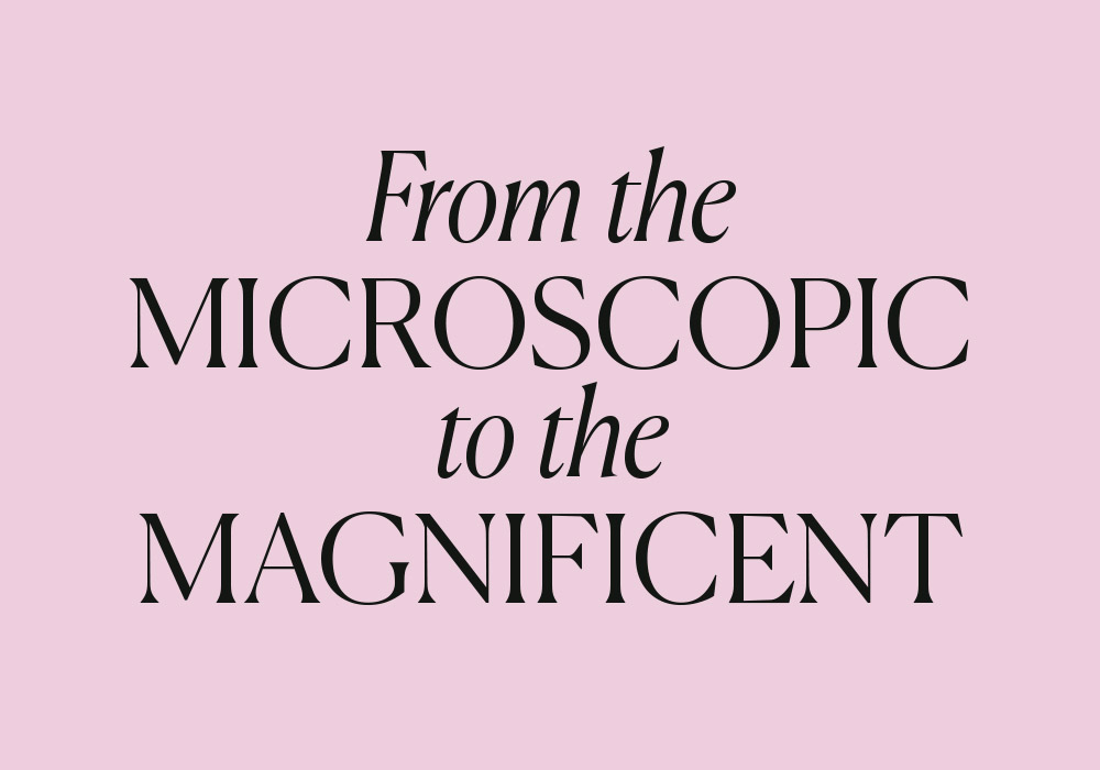
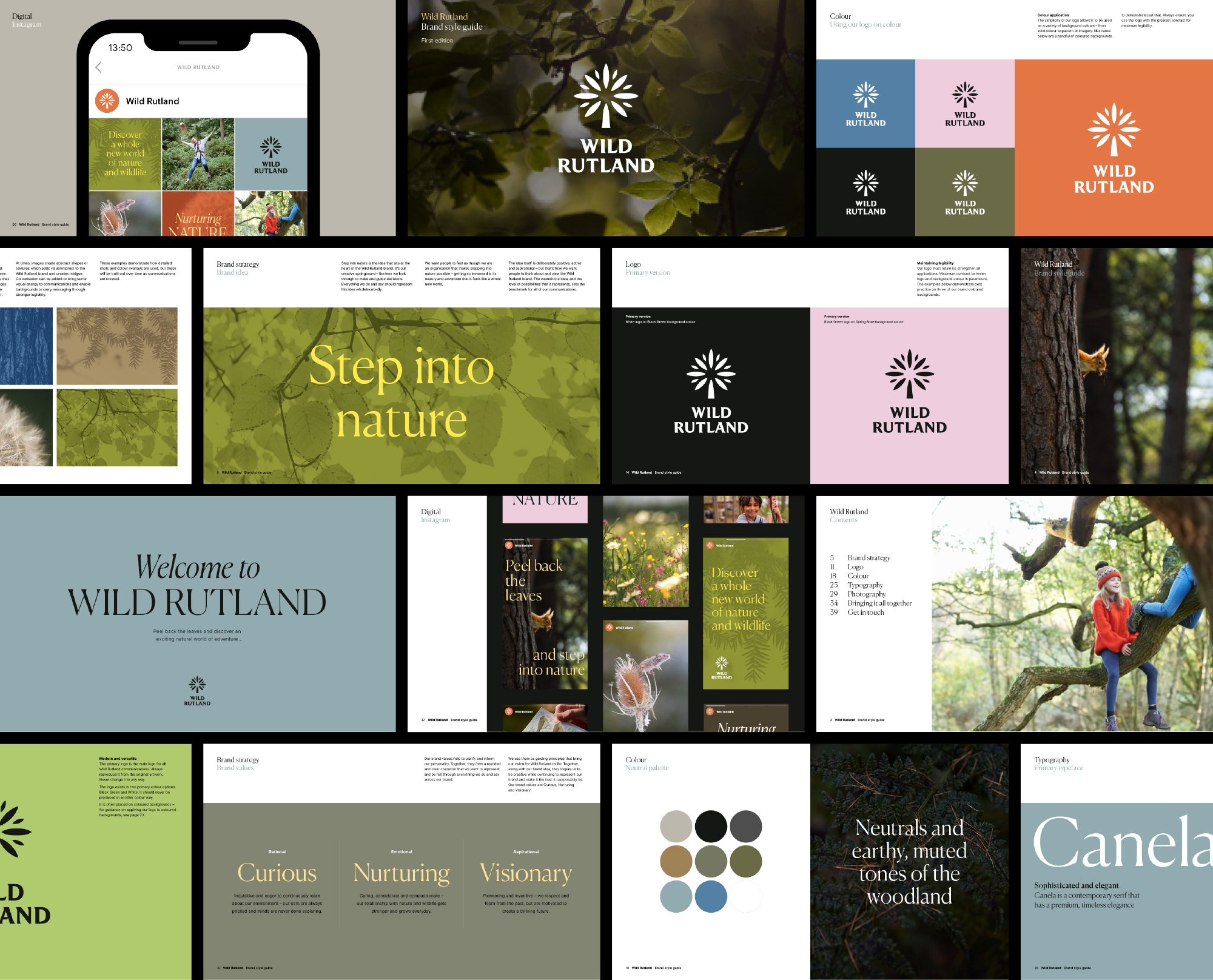
At the heart of Wild Rutland brand is a brand idea as ambitious as the project itself: Step into nature. Inspired by the stories told by those behind the vision of the project, and the visitor experience they aspire to create, the idea sits central to the brand and serves as a lens to look through to guide decision-making.
Supported by a set of x3 unique values which work in harmony to create a distinctive personality for the brand, the idea required a name, brand identity and expression that could easily demonstrate energy and adventure while also allowing moments of pause for reflection and discovery.
While inspiration from nature is easy to come by, we needed to ensure the brand was authentic and meaningful to the area it represents – so we looked deeply into the landscape, its heritage and the specific species that call it home to develop naming ideas and potential design routes.
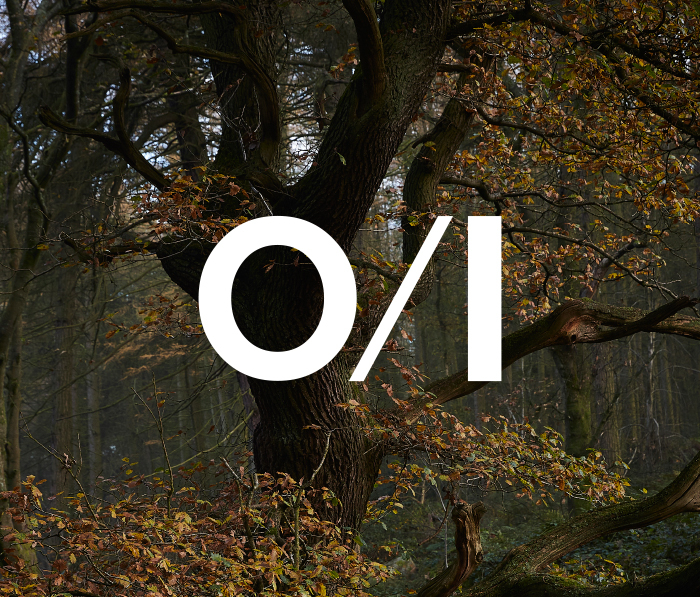
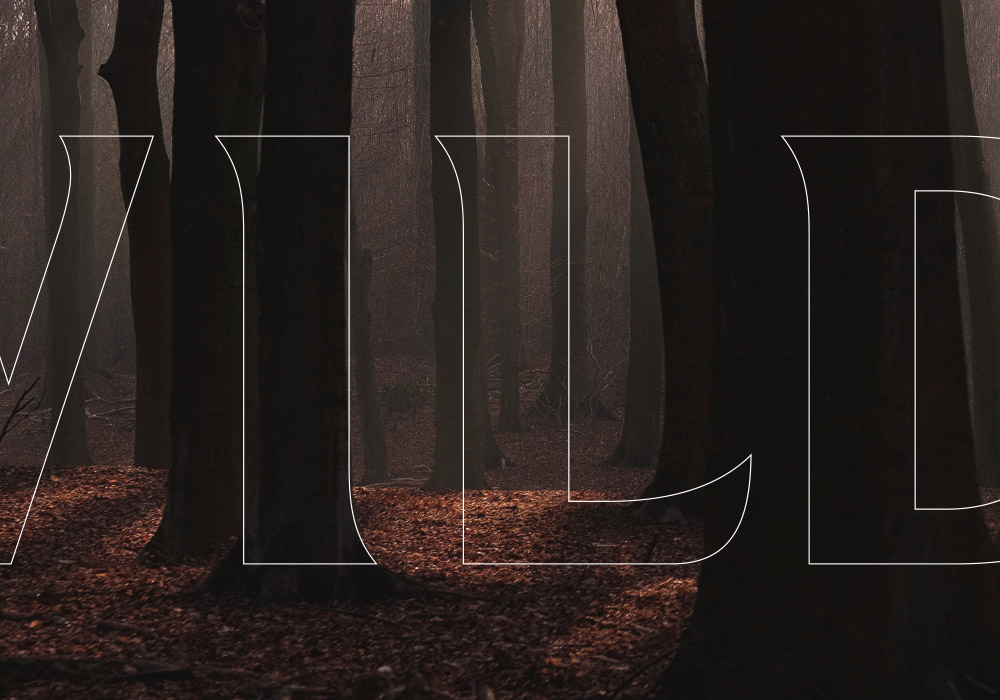
After securing buy-in on our recommended name, we crafted an identity that features an elegant symbol and solid wordmark that showcases the strength of Wild Rutland’s woodlands. The elements of the logo were finely crafted to be sympathetic to each other – with the leaf-life shapes of the symbol utilised to add a touch of distinctive quirk to the lettering.
Establishing a real premiumness for the brand was a key part of our brief, so we selected typography that could signify sophistication and elegance while always remaining playful and flexible. Applied with gusto, Wild Rutland’s toolkit provides options for edginess and standout – especially when combining italics with regular and playing with scale.
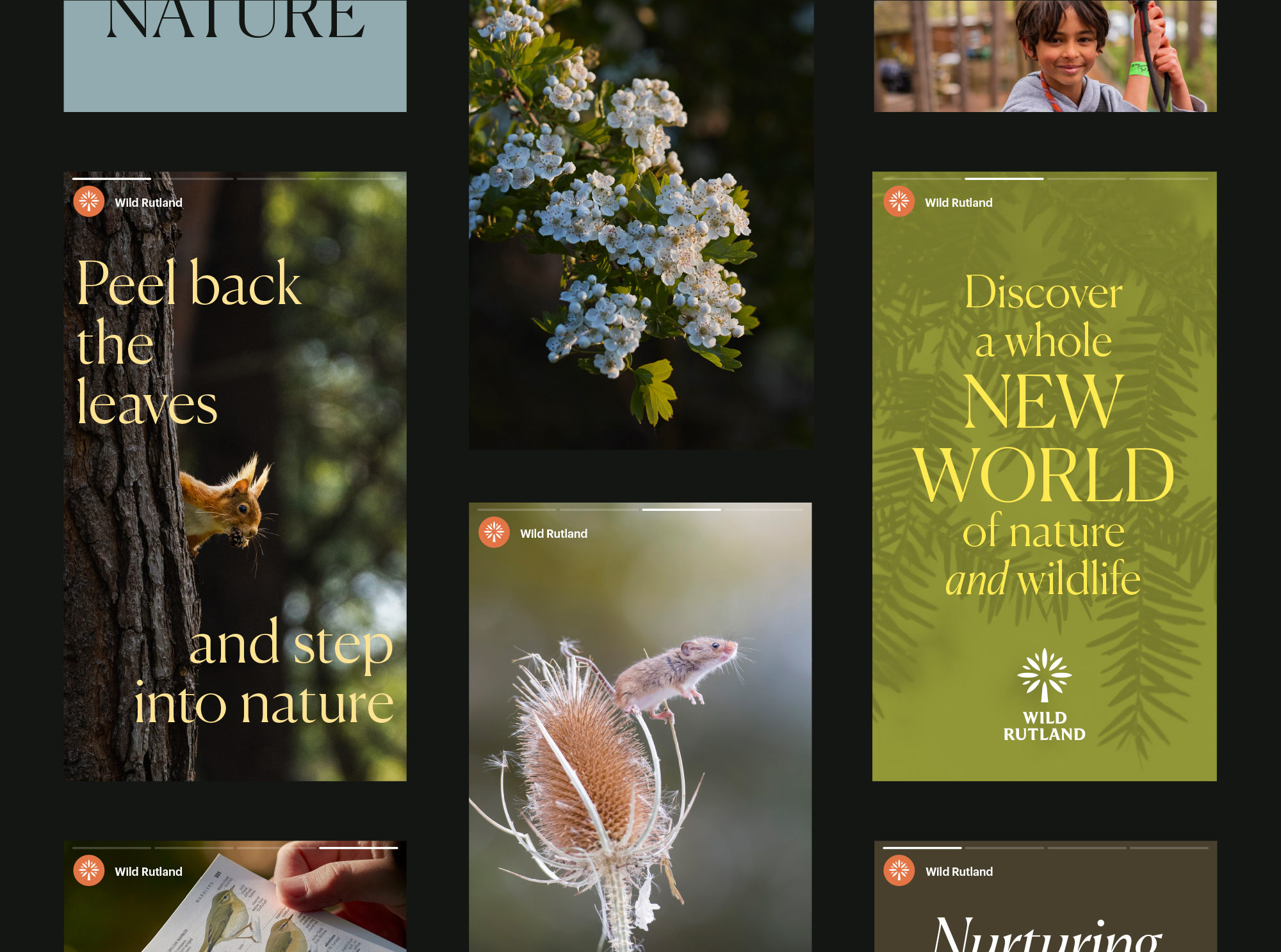

The brand’s colour palette is inspired by its landscape – featuring earthy, muted tones of woodlands which contrast with vibrant pops that represent flowering meadows.
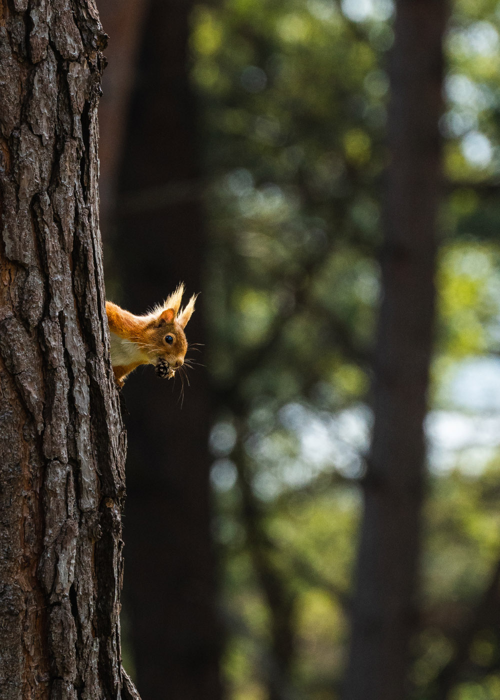
Textural-heavy photography was introduced to signify how close Wild Rutland gets you to nature in a literal sense, but also to demonstrate the beauty of nature that might go unnoticed.

From their site visits and dialogue with stakeholders through to delivery of the final brand, Cubic demonstrated a clear understanding of our vision, the difference we intend to make to our local area and, ultimately, what we hope Wild Rutland will become. We’re thrilled with the brand they’ve created, and are looking forward to growing into it as the project moves forward.
Hugh Vere Nicoll
Chief Executive Officer, Wild Rutland