IMA Group
Thinking forward
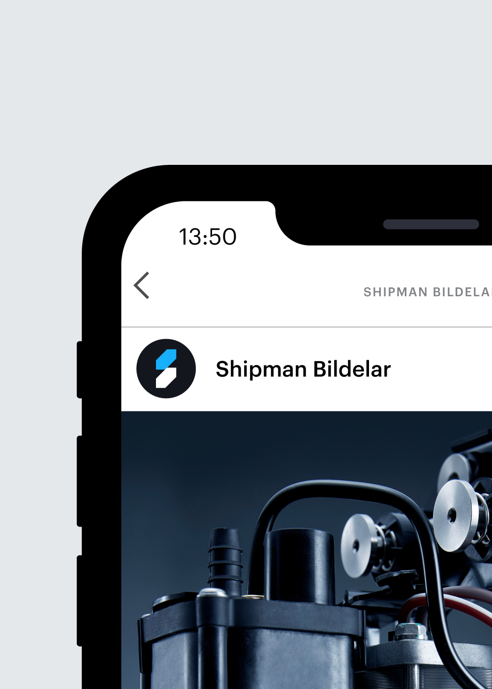
Shipman Bildelar is a leading supplier of auto parts to the Nordic market. Based in Sweden, the brand supplies the high-quality references the Nordic market needs at competitive prices. Part of IMA Group, an end-to-end product partner to the global auto parts industry, Shipman’s innovative approach enables them to be the first to market – often fulfilling untapped consumer demand before it arises.
Having grown substantially in recent years, and recognising that the way their business looked and felt didn’t nearly do it justice, the Shipman team tasked Cubic to refresh the brand from the ground up – including the creation of a new brand strategy, a progressive identity and modern expression.
0+
Shipman applies over 40 years of knowledge, experience and commitment to support and deliver for its customers every single day.


Getting under the hood
To align the Shipman team and ensure we understood both their ambitions for the future and issues facing the current brand, we kicked the project off with an interactive workshop that focused on the basics of brand-building and our initial observations on the category. Using insight from the workshop, competitor audits and further stakeholder conversations we developed a new, compelling brand strategy that articulated what Shipman should stand for in order to utilise its strengths and stand out in its competitive marketplace.
With Shipman needing to communicate in Swedish as well as English, depending on its audience, we also had to get to grips with what impact translation would have for design layouts across various touchpoints – as well as being aware of cultural appropriation regarding the brand’s photography and overall styling.
Where to?
With the brand strategy in place, we set about bringing it to life through concept work – considering and working through numerous different possible articulations and design directions before filtering our work down into two distinct brand concepts. Each interpreted the same brand strategy in a slightly different way – using identity and expression elements of their own to bring it to life.
After sharing the concepts during a working session with the project team, we landed on a clear direction of travel and a design route to continue to build out, refine and finalise over the coming weeks.

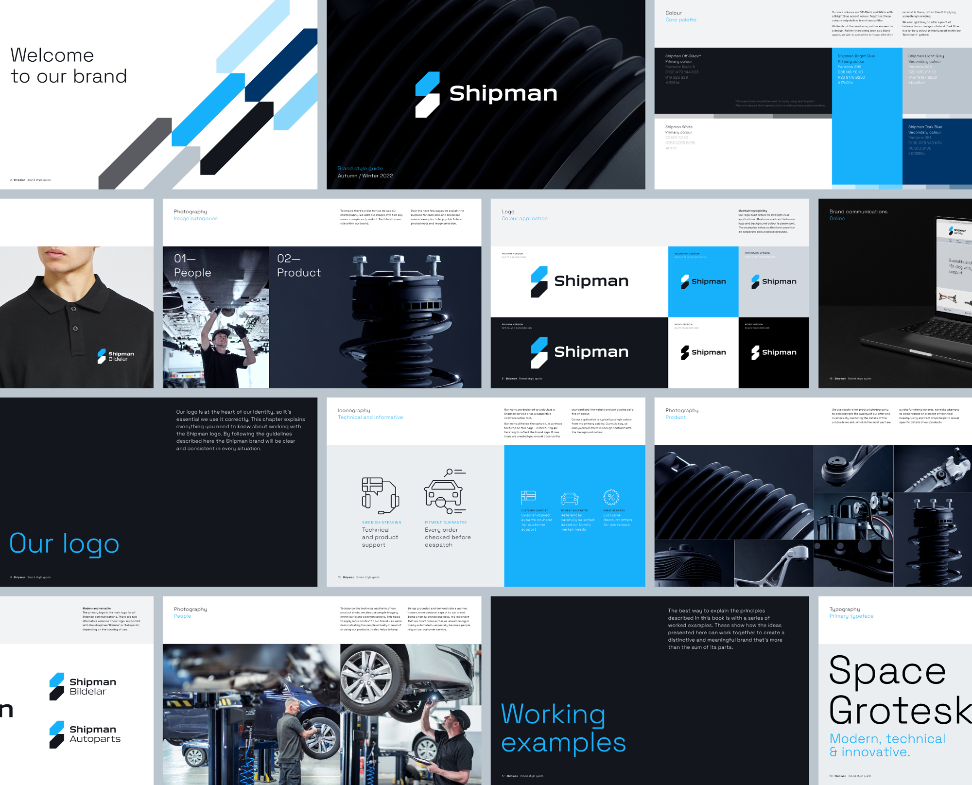
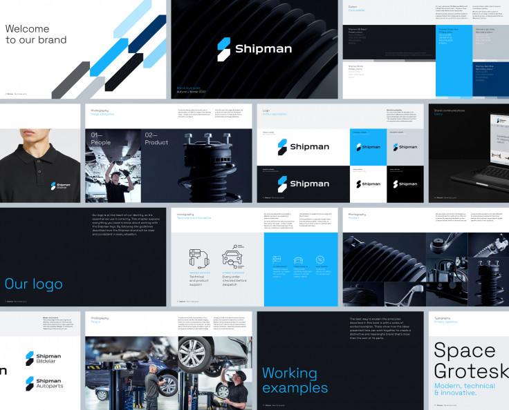
An inventive identity
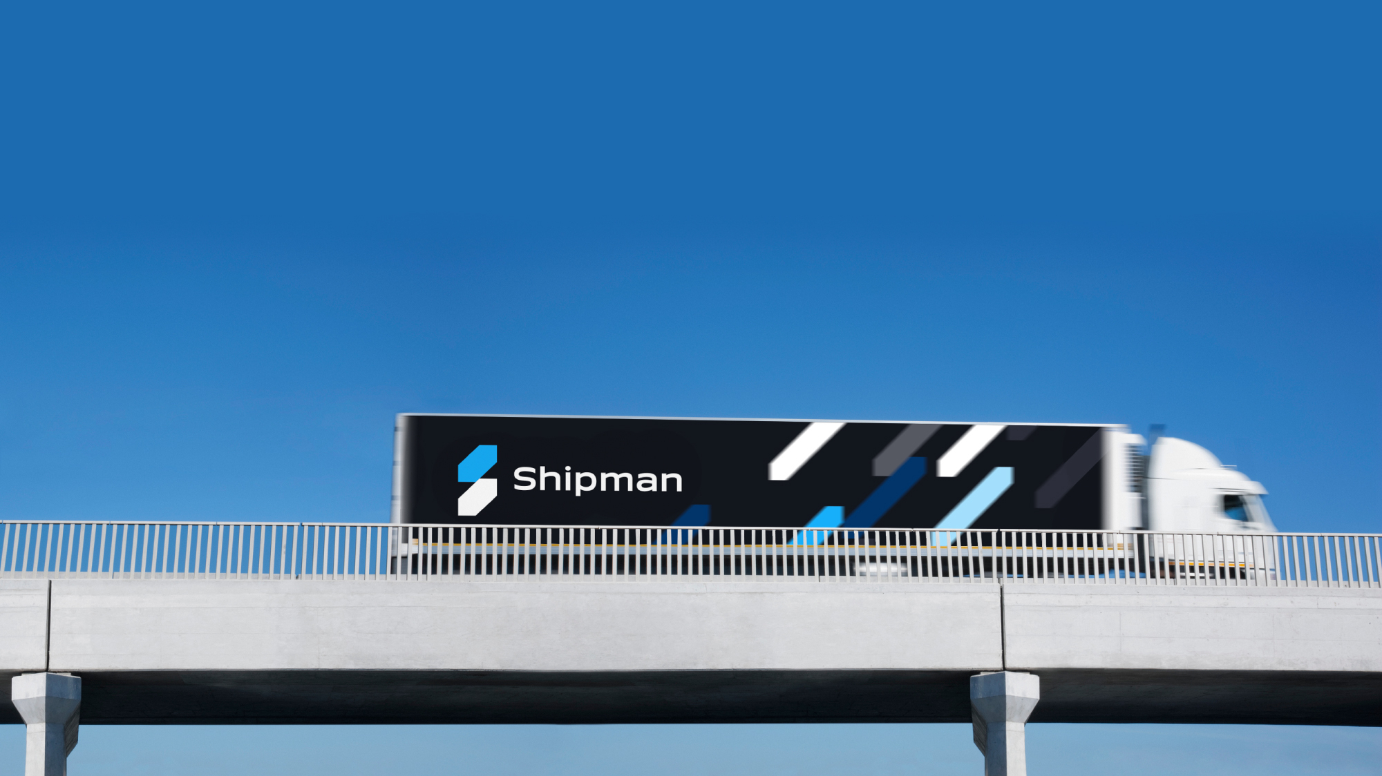
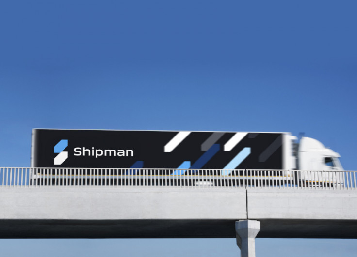
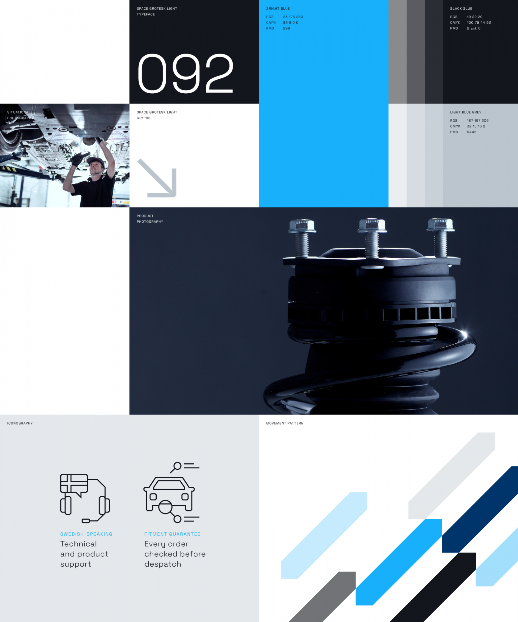
We refined and honed the chosen concept’s identity – crafting a mark that felt solid and dependable yet also gave the brand the option to be expressive and a little playful at the right times. The shapes that make up the identity’s symbol feature 45 degree angles to add a sense of forward movement and progression while also tying the brand neatly into the overall architecture system we created for Shipman’s parent brand, IMA Group. It also works across multiple lock up options, including with and without ‘Bildelar' (Swedish for 'car parts'), so has the flexibility that the brand required.
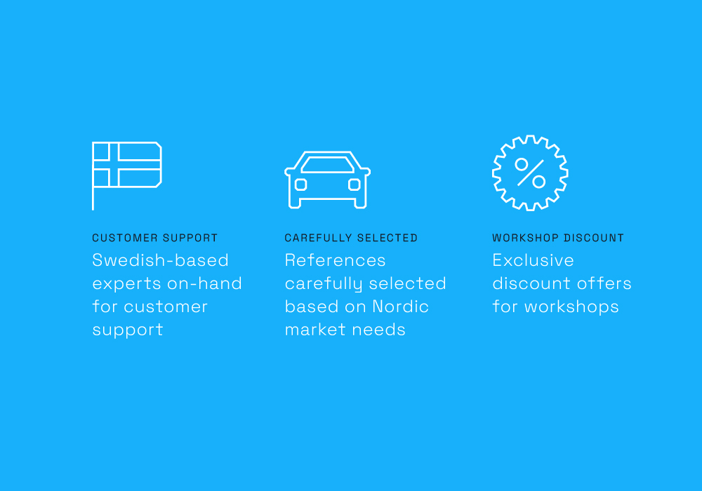
When combined with a technical-feeling typeface, the new Shipman logo became the centrepoint of the brand’s expression which featured a punchy and bold colour palette, stripped-back graphic treatments and the creation of bespoke iconography and animated movement patterns. Together, these elements allow the brand to flex across all necessary applications and forms of communication – giving Shipman the potential to dial up or turn down its volume at appropriate times.
Adding sophistication
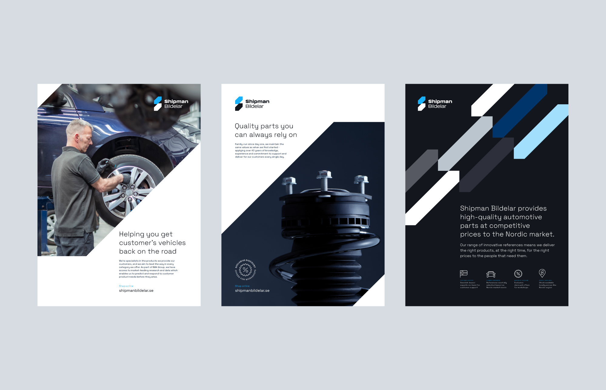
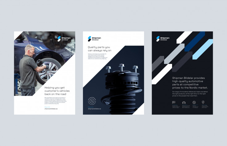
To add a layer of technical elegance to the brand, as well as communicate the premium quality of products it supplies, we shot a series of new photography that heros and elevates Shipman’s best-selling automotive parts. The idea behind the photography was to demonstrate that although on first sight car parts are just functional lumps of metal, there’s a beauty to them when you look a little closer. Capturing the detail of parts up close, and focusing on the technical precision that goes into them, meant Shipman could communicate its engineering knowhow and constant innovation without relying on messaging alone.
Through considerate crops and modern, progressive design treatments, the photography style became a key identifier for the brand – and meant it didn’t rely solely on workshop or manufacturing-based images like the majority of its competitors.
Rolling out
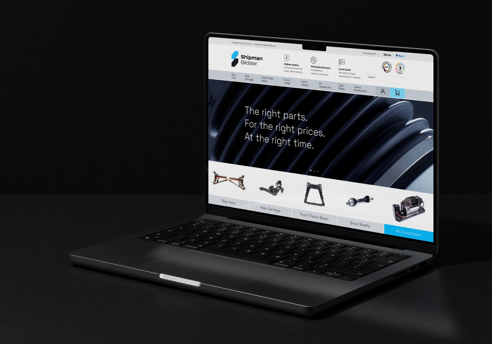
The brand was rolled out across numerous physical and digital applications – but the focus initially was on communicating the relaunched Shipman brand to workshops around the Nordic region. In order to get the brand in the hands of decision makers, we developed tactical marketing collateral including brochures, leaflets, press ads and sales materials in both Swedish and English languages, as well as consulted on the brand’s refreshed website to ensure its new identity and expression was applied effectively.
The new Shipman brand represents a significant milestone for us as a business. We placed our trust in Cubic to undergo this important project and they’ve more than delivered. Their creativity and commitment has produced a brand that sets us up for an exciting future. We’re all looking forward to where it will take us.
Richard Shipman
Managing Director, Shipman Bildelar